This week, my publisher sent me the final version of my debut novel’s cover. And I love it! But it took me a minute to adjust to it.
It’s weird, but for some reason – despite The Love of My Other Life being a contemporary romance novel – I wasn’t expecting that it would have one of those adorable, colourful, illustrated covers that are on trend right now. I had it in my head that it would more of a photographic cover, perhaps with the back of a woman’s head in a mirror, or some other elegant photographic treatment to show the split lives that make up the plot. Something sumptuous and glamorous.
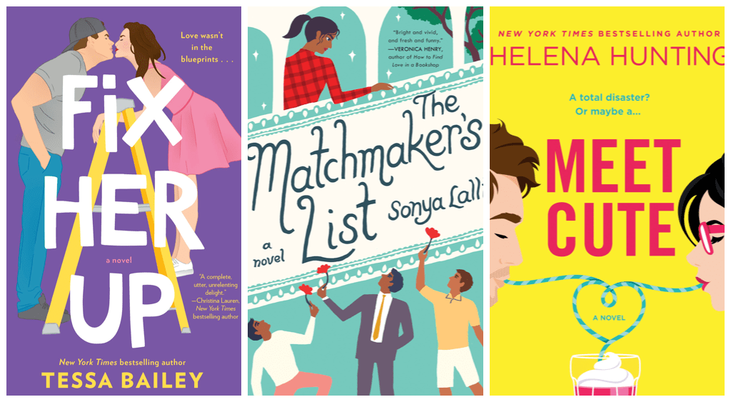
So when the cover came back – after, I’m told, a lot of back and forth with the designer to find one that shows that split-life element – yep, I was surprised when it was an illustration. A brilliant illustration, and one that absolutely captures the story and its dynamic. And a cover that I would 100% pick up to read that book – I’m actually a sucker for those kinds of graphics. Like these!

Why didn’t I think my book would be one of those books?
I’m not sure, but I think the answer can be found in the visual moodboards I’ve created for the book and its locations (which I’ll share here and via social, later). Those colours and images are rich, dark, complex. Indeed, the moods within the book are themselves rich, dark, and complex. The feels in the book range from terror to confusion to comfort to romance to joy to passion to rage to depression to defeat to hope (in that order). And the ambience of the story ranges from luxurious New York glamour to dark neighbourhood grit to ancient Italian opulence to coastal serenity, and more.
That’s a lot to pack into a novel with an adorable chick-lit cover!
But I’ve realized this is true of most of those contemporary romance books. I mean, take a look at Marian Keyes’ covers, with their funny little illustrated characters and black-and-white cityscapes. Hers is probably the writing style that mine is closest to (I’ve been told this by several sources), and she also tackles deep topics, such as depression and addiction, in amongst the humour and romance.
I guess a cover can’t do everything all at once, and I’m willing to let go being able to express ALL the feels on my cover. What I’ve been provided with is fabulous, eye-catching, commercial, gorgeous, exciting, accomplished, and very clever. It may have taken me a second to adjust my own expectations, but I absolutely love it!
Oh, you want to see it? Stay tuned… cover reveal coming soon… but here’s a tantalizing glimpse in the meantime, below. And check out the corner reveal of the last word of the must-read-this-book tagline! Mwah-ha-ha…

